Creaptive Heart
A downloadable game for Windows
Coping with the loss of a close friend, Elisa Mayer finds herself on a quest for answers. In her friend's drawings, she believes lies a hidden message.
Download
Download
CREAPTIVE HEART.rar 31 MB
Development log
- Creaptive Heart - Minor UpdateJun 02, 2019
- Creaptive Heart - +Screens and a question:Nov 25, 2018
- Creaptive Heart - Check it out!Nov 21, 2018


Comments
Log in with itch.io to leave a comment.
From RPG Game Maker Reviews:
Score: 91/100
Concept
You are Elisa, looking through your dead friend’s drawings to understand what he was thinking.
The Score
Story: 10/10
Creaptive Heart shines in a couple of areas, and this is the first. The story is very engaging. Though a bit confusing and “artsy,” it does make you want to figure out what’s going on. By the end of the second drawing you explore, you start to get a very good picture of your friend’s state of mind.
Characters: 8/10
Ciclope has done a fine job of helping us get to know her characters from their conversations, thoughts, and attitudes. The only aspects that are missing are personality quirks and distinct patterns of speech to make them more memorable.
Writing: 8/10
Overall, the writing tells the story very well. There are a few instances, however, where I noticed some typos or awkward phrasing. I also wish there was more writing in some places to give the player more explanation about what to do (but more about that in the Gameplay section).
Mapping: 9/10
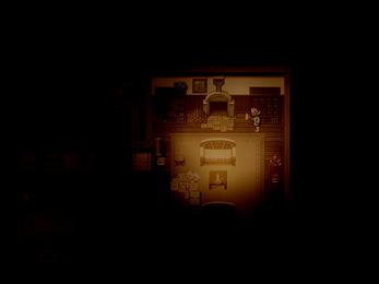
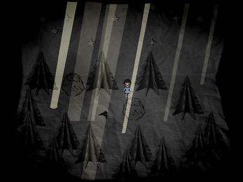
Most of the mapping is great. The areas are well-laid out, look nice, and, when it comes to the drawing maps, very creative. The only detractor was the similarity of the drawing maps. You’ll see many of the same elements even though they’re supposed to be different drawings.
Art: 10/10
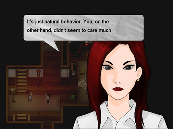
The original art that went into Creaptive Heart is fantastic. Everything is custom, from the character sprites to the character busts to the map elements, and all of it looks very professional and is well-suited to the mood of the game.
Creative Game Design: 10/10
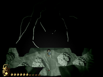
The concept of Creaptive Heart is very creative. You enter and explore the drawings of your friend. Ciclope also sets the game apart with on-map combat and moving obstacles.
Gameplay: 6/10
Most of the game is exploring and asking yourself what is going on. Then, once per area, you have to defeat an enemy or a group of enemies. All of the combat is on the map screen, but it’s also challenging. Maybe a little too challenging.
There’s also a lot of guessing about what you’re supposed to do to these enemies. For instance, in the first area, you have to shoot fire from your lantern at them, but the game doesn’t tell you to shoot them with your lantern or even how to do it. You have to avoid the second enemy while collecting an item, but again, the game doesn’t tell you what you’re supposed to be doing, so you end up dying at least once before you figure it out.
On some screens, it was a little confusing to determine who was talking, so different colors of windows or names would have been helpful.
Technical: 10/10
Creaptive Heart runs well and makes great use of lighting effects. Not only do you have your lantern but when you lose health, the screen flashes black, making it even more difficult to see the enemies and where you need to go.
If you’re familiar with RPG Maker games, you’ll also notice evidence of other plugins that help the game stand out as unique.
Music: 10/10
The music that’s in the game sets the mood very well, but most of the game doesn’t have music. Normally, I would say that the lack of music makes a game seem empty, but not in this case. The story is so engaging that I hardly noticed the absence of music. In fact, the silence created the mood just as much as the music did.
Sound: 10/10
The sound effects are well-placed and plentiful enough to help immerse you in the story.
Recommendation
If you like mystery games and don’t mind the “artsy” style, you’ll probably find Creaptive Heart to be quite engaging.
_ _ _
Would you like to see your game reviewed?
Okay, first of all, thank you so much for giving the game such a thorough analysis. We all love to see the general public's reaction to our work, but, personally, receiving reviews based on a more technical point of view is something that I found extremely rewarding.
And now, without further ado, let's go:
>>> Quote:
"... typos or awkward phrasing. I also wish there was more writing in some places to give the player more explanation about what to do (but more about that in the Gameplay section)."
I'll have to agree. All the three scenarios will be revisited in the future chapters, by the perspective of different characters (AKA: Laura and the dead friend himself), so the plan was to have a lot more dialogues in each map, but at the first visit, I ended up cutting a lot of the talking in order to keep the exploration at a faster pace. Now that I've been receiving feedback, I can see that a few more cutscenes are necessary, especially when the player enters the combat sections.
About the typos and awkward phrasing: I'm trying, aaaaa D=> Being a non-native English speaker makes it a bit harder to get the naturality of the language. I hope to improve on this aspect, since the story is the main element of the game. One thing I can say, is that I'm always reading the dialogues over and over, rearranging words, changing bits here and there, trying to improve them.
>>> Quote:
"Most of the mapping is great. The areas are well-laid out, look nice, and, when it comes to the drawing maps, very creative. The only detractor was the similarity of the drawing maps. You’ll see many of the same elements even though they’re supposed to be different drawings."
Good point. Unfortunately, we couldn't create a different Tileset for each drawing in time, but for the future, we're planning to rebuild the scenarios from scratch. There are two possible options we are testing: new hand drawn Tilesets or actual dioramas, photographed, edited and transformed into a kinda "Parallaxy" thing.
>>> Quote:
"On some screens, it was a little confusing to determine who was talking, so different colors of windows or names would have been helpful."
Got it! I'll probably use Faces for the diorama sections.
>>> Quote:
"If you’re familiar with RPG Maker games, you’ll also notice evidence of other plugins that help the game stand out as unique."
I'll take it as a compliment, since we didn't use any Scripts or Plugins =D (I believe RPG Maker XP doesn't even have Plugin support). In other words, it was all event based ^^
>>> Quote:
"The music that’s in the game sets the mood very well, but most of the game doesn’t have music. Normally, I would say that the lack of music makes a game seem empty, but not in this case. The story is so engaging that I hardly noticed the absence of music. In fact, the silence created the mood just as much as the music did."
Ow man, thanks a lot! We had the goal of creating all of the Game's resources, and since my wife and I are both into drawing and pixelart, the visual aspects of the game were done with ease.
But........... the music, oh boy! Considering the fact that we barely know the notes and scales, it makes me really happy to know that the one song I was able to make ended up contributing to the game's mood, instead of ruining it.
==//==
Once again, thank you so much for the Review. And I'm glad you had a good experience playing the Game.
=)
I'm glad to hear you're continuing to work on the game. It'll be that much better when you're finished. And thank you for your responses. If you would like help naturalizing the language (most of it really is pretty good), let me know. I'm a book editor by profession.
Fantastic game! I found the story to be very addicting and with a lot of interpretation for the player to dive into. The gameplay was also unique and to its own. Great job! And feel free to check out my play through of it in the video below:
such..a...great..game:)
Thanks for giving the game a try!
Parabéns pelo primeiro lugar Ciclope! Bom trabalho :)
Opa, obrigado o/
Oh man, this hit home in so many ways. Thanks for sending me a note online to check your project...! It was an interesting journey. Brace yourself for the text wall! Let's see...
Personal notes: I'm slightly disappointed the "tie man" scenes were so short, and that the "water art" felt so empty after the two first ones. I was expecting seeing at least one misterious NPC. *chuckle* Truth be told, the umbrella challenge, while made just so for the difficulty, felt a little more frustrating than anything. While I didn't die, there wasn't nothing to "solve" or "understand", no patterns or anything, just a lot of reflex and turning your umbrella around. It was somewhat hard to be sure that the water was coming on the same line/column I was at. That made me a bit sad. It's important to reward the player for understanding your game, not only story-wise, but also your challenges. If it's just chaotic, it feels like blind luck. ^_^' Finally, I'm not 100% sure about what to think on the door bell thing yet. I may have missed something, or maybe my guess that the main character is going a bit crazy even if she doesn't want to admit is right. I just want to point it out it isn't very clear, I'll go through it again and see if I missed anything, but neverthless I believe the ending needs a little polishing.
And at the end... Anyway, let's see... I say 4/5, extra star for effort. I know there was a lot of criticism above, but that's how one develops yeah? We can't grow on praise and sun alone. *chuckle* I'll admit, there is always more to point out and more score to take away if we're being picky, but you are beginning to spread your winds out there and the work looks... Soulful. Which is somewhat rare to find and counts as a giant bolds extra points from me. Whatever your guts is telling you, it's poiting you the right way. Follow it, polish things, and have no fear of scrapping parts of your work to keep inconsistencies and bugs from happening. Best of luck!
YES! This is why I make games - wall texts <3
> About the art in general - I'll have to agree. My main focus was always the storytelling. I consider myself good at "concepts" but not so at "execution". Everything that you've pointed out was a concern during the development period, but we decided to focus on the core and let the result of the contest decide for us, whether or not we're going to spend time (and possibly money hiring someone) to improve the visuals.
> The portraits' color, yeah, we sometimes try to keep the "VideoGame" look to keep the player's guard down. In other words, a serious story can hit even harder when the player doesn't expect it from a colorful and simple game. But sometimes it can be bad to try getting the best from both worlds - we'll definitely make some changes adjusting the visuals to fit in the game's tone. Thanks a lot for pointing it out.
> Audio: I was kinda afraid to use music and SEs, due to the dangers of copyright infringement (Most of the SE sites make it hard to understand their policies about the use of resources) - I really thought the contest would reward original resources, that's why I didn't use Scripts or SEs that I use in my main project. Making music was painful and the result wasn't satisfactory at all. Improvements on sound in general are definitely a priority for the future.
> I'll have to go into Spoiler territory, but don't worry: You're right, I focused on story and only one type of mechanic per Stage, thanks to the fact that every Stage will be revisited when Dr. Laura "joins the team". She, as a psychiatrist, will be the one solving puzzles to help Elisa understand the real meaning of every clue/character that she had interacted with.
Color clues: well, the Red Moon is Laura, so that kinda emplies that she already went through all the drawing with Elisa before.
Blue Moon is Elisa's Denial mechanism giving you health so you can keep your delusions - unfortunately, the story process didn't allow me to show these details so early in the game. I could do it, but it would be forced, so I decided to wait for the right timing.
> Gawd damn those candles... I'm gonna put a thousand arrows pointing to the basement =D
> Characters: They were inspired by real people. I think this is the best way to connect with the player. We all went through similar paths in our lives, I guess, and I'm glad to know some of the characters managed to bring you memories from real people - it's always my goal.
>The mother is... basically my mother =D It's really hard to flesh out a "binary" character, as I call it. Every conversation has its goal, but it's easy to get off the rails when portraying a complex character in simple dialogue. I'll definitely study her persona and try to show her colors in a more effective way to the player.
> You're absolutely right about Dr. Laura. The Psychology element wasn't well portrayed at all, but there's a reason. Think about it this way: Laura is not talking to Elisa, she's trying to break her delusions created by Denial, guilt and defence mechanisms. After the last scene, she'll calm down and talk to the real Elisa, because they've been through all that before.
BUT, yeah, I'll study/read a little bit more when the time comes to portray an actual psychiatrist. I've tried to watch movies about it, but they too tend to exaggerate things a bit for the purpose of entertainment.
> Short scenes: they'll be revisited from Laura's point of view, don't worry o/
> Water Stage: the mysterious NPC is the Red Moon =D The stage was shorter given the fact that Elisa was running against time, also... I was running against time in the game development - kinda meta, one could say, tee hee - But yeah, I agree it was a shallow stage...
> You got it right about the Ending. It' more like "Elisa was twisting some of the clues and interpretations in order to fit in her own version of the story". There was a discarded scene in which the player sees Elisa going to the basement and picking up the box - I'm gonna add it as soon as I return to the Dev process.
==//==
Abso-f*cking-lutely. That's exactly how one develops, and I really appreciate true criticism. I'll definetely read your text along the Dev process to make sure everything is receiving the attention it needs.
Thanks a LOT for your comment! And I'm glad you enjoyed the game despite its flaws.